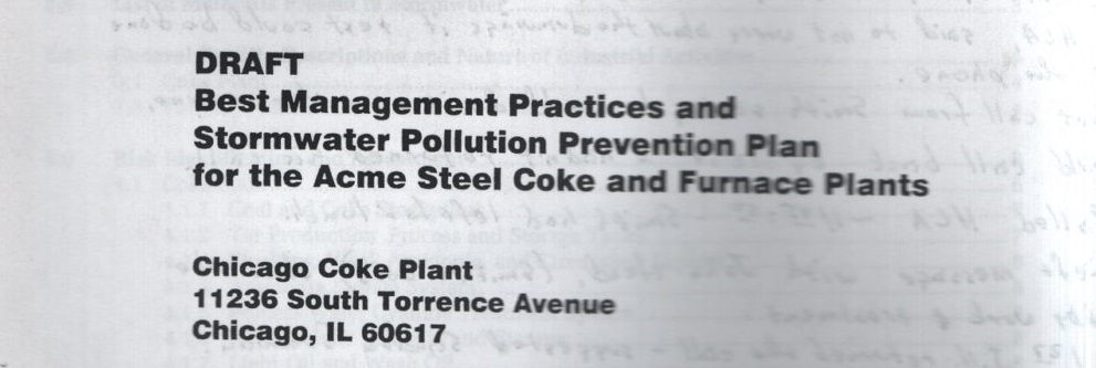
I initially covered finding this massive text back on site visit #15. This is a draft written by an outside vendor and clearly Acme was not happy with the results. I shared a crop previously – the inside front cover is filled with notes about the difficult correspondence with the vendor, here they are in their entirety.

Much of the report is boiler plate and the entire second half is an ‘appendix’ with page after page of EPA reporting. A big, heavy, and quite boring notebook if I ever saw one (and in weeks of digging, I’ve seen a few).


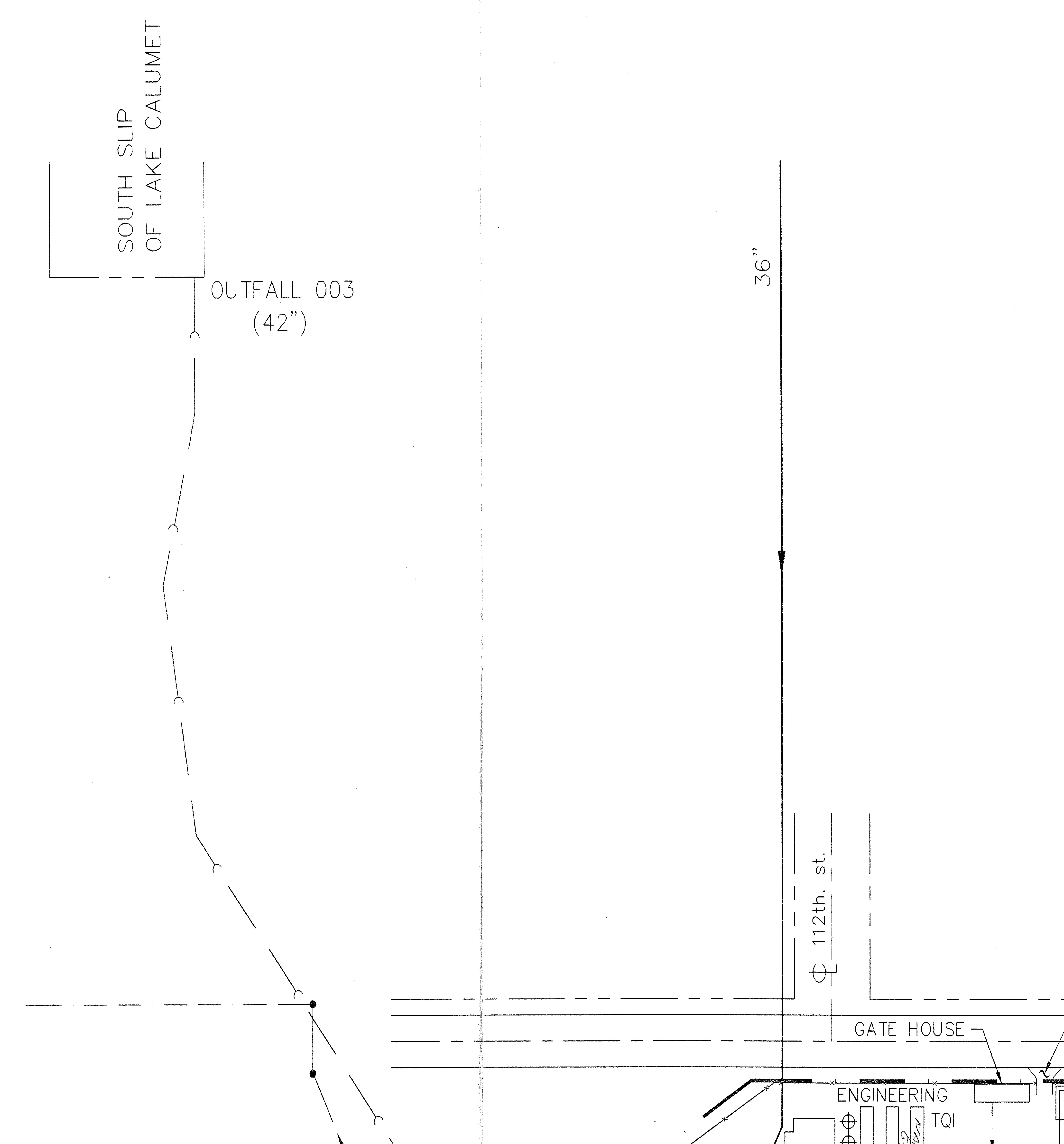
So what good is this thing besides as a door stop? You always have to look more closely because in the strangest places you might find some very useful information. First of all – it includes four maps – two of the coke plant and two of the furnace plant. Unfortunately, it is also supposed to include topographic maps for each facility but apparently these were not ready at the time the draft was printed.
Conveniently, the coke plant maps are massive (approx. 47″ x 36″) – the furnace plant maps are only 18″ x 12″. I had the large coke plant drawings scanned by the professionals at Accurate Repro and have gleaned some important info from them. But before we get into that, let’s look at everything else.
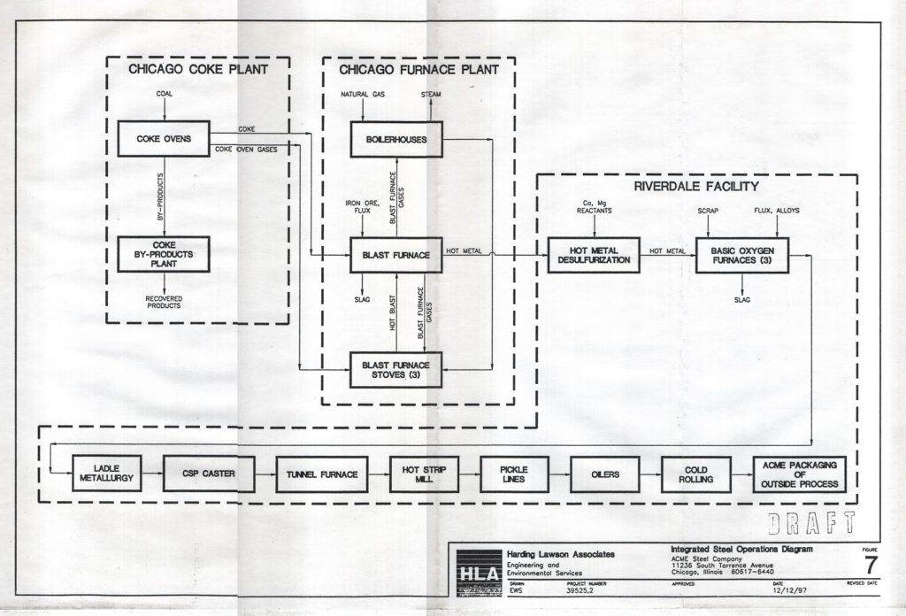
The introduction gives an excellent synopsis of operations at both plants. The first paragraph is as good of a summary as I could come up with.
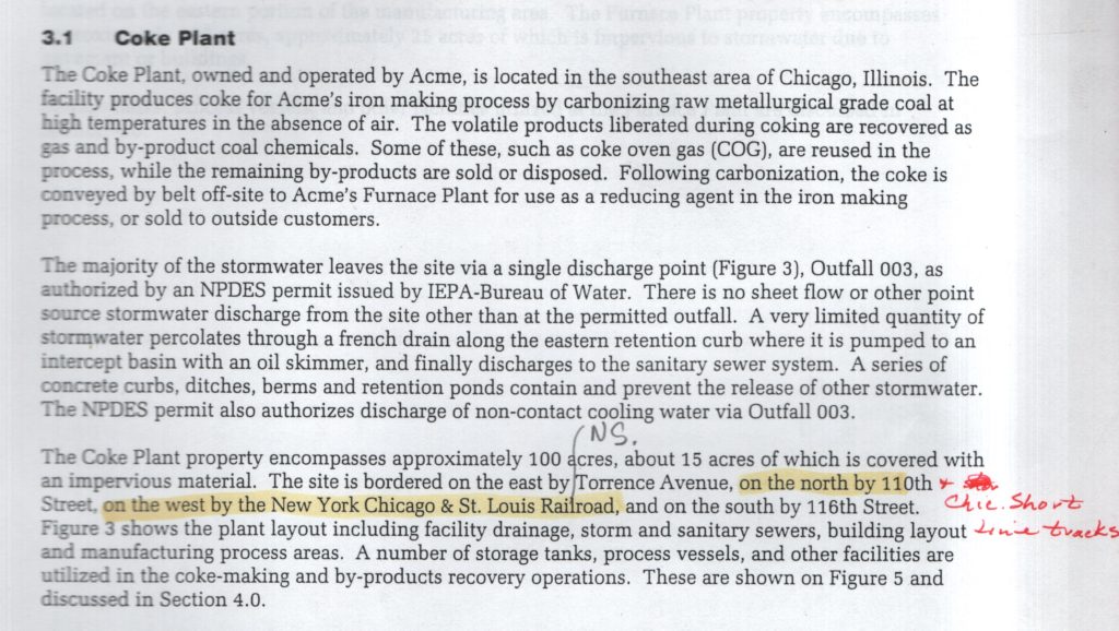
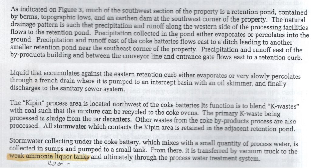
The second paragraph didn’t interest me initially but like most things, the more you dig in, the deeper you go. I thought it was pretty impressive that all the drainage in a 100 acre property ran back to a single outlet and I was curious where it led. I should have known – the Calumet River across the street (which is mistakenly labeled as ‘Lake Calumet’, one of many errors).
A closer look shows that the storm sewer runs south through the plant, all the way back to the ovens department. A number of points are labeled ‘M.H.’ – what could that be?

The M.H. reference sounded familiar – I had seen this before…
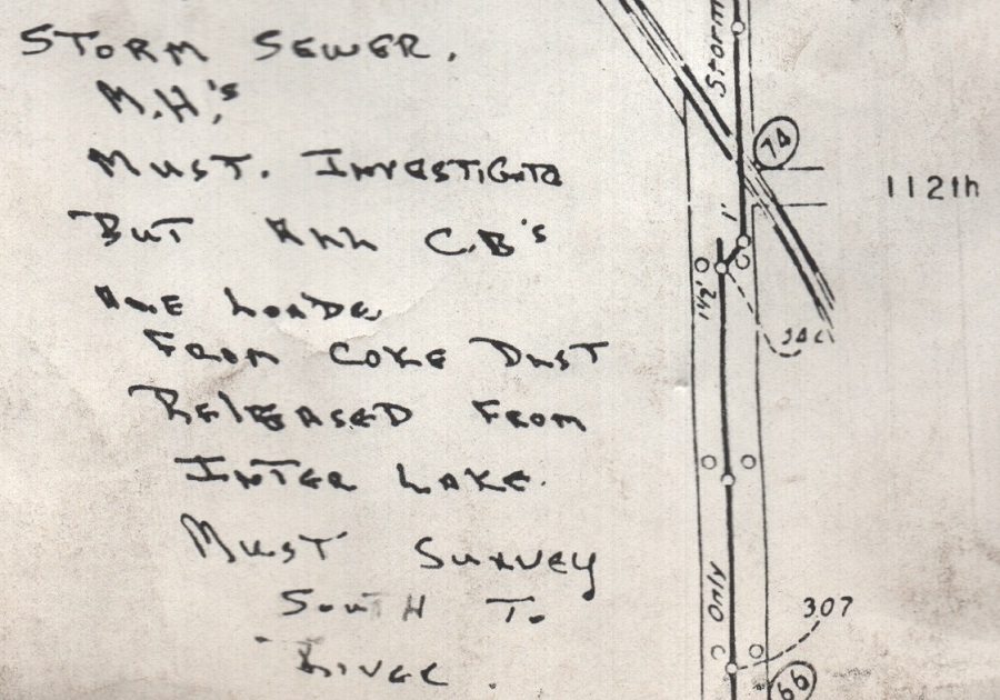
Then it dawned on me – man holes. Also very interesting was the well phrased description of the furnace plant. I was not aware that there were two furnaces, or that only one was in operation (at the time this was written).

It was this general description of the plants geography and function that was intriguing to me, a further discussion of the outlying areas of the coke plant brought me back to the warm days of summer where I’d walk through the cattails and be careful not to walk into a clearing and stumble right into one of the retention ponds.
I had seen the name Kipin come up before in relation to the CCH department, but I never before knew much about what they did. It was my understanding that they were essentially a third party who worked in the plant doing some part of processing in coal handling. Turns out they are still around but the first photo on their single page website shows some demolition going on. I thought maybe I was on the wrong website until I scrolled down. In the ‘About Us’ section, the first heading is ‘DEMOLITION’ – a good illustration of the coke industry in America. If they can’t help operate coke plants, they can do the next best thing: tear them to pieces.
And finally, onto the maps. Besides the furnace plant maps being smaller, they are of much lower quality. They are existing drawings provided by the plant which were then copied and reduced in size. For both plants, the difference between the ‘plant drainage’ drawing and the ‘general layout’ drawing is just attempting to label structures on the property and MHs, etc. Here is the really poor quality furnace plant drawing:

And finally onto the fun part, which is attempting to overlay the coke plant drawing with Google Maps satellite view. First up, let’s look at the area of the quench tower. It seems that they may have drawn the quench tower in 2D, on it’s side (this is an aerial view). I am not clear on the plant having a scrubber for the quench water, my understanding is that filtering was done in the quench sump before it was returned to the water tower. Perhaps another oversight when this was drawn. Otherwise, the scale is quite good.

And last but not least, I have compared the area near the gate house. Finally I have some of these buildings properly labeled, including the remaining foundations from long since demolished buildings. I’d argue that the laboratory portion of the main office is not large enough to label the entire building ‘LAB’. The collapse on the north side of the BP office starts to make sense – the remnants of the main sub-station. Otherwise excellent scale and some valuable information. Hard fought for sure, but worth the trouble to navigate this mammoth report!
